


interview prep no. 56
Relaunching the Newsletter | Product Sense | Live Coaching is Back


Thank you all for your patience as I took some unannounced personal time. I used the holiday weekend to reset, and I am (slowly) ramping the newsletter back up. For paid subscribers, I know I owe you a lot of content, and I will try to make up for lost time in a number of different ways over the next 6 to 8 weeks.
After a reintroduction, this week’s newsletter has two focuses: (1) product sense skills building, and (2) twice weekly group coaching sessions for paid customers.
This Week’s Highlights
Reintroduction Me & My Newsletter
Product Sense Calls to Action
Paid Customers ONLY
Live Coaching Sessions Link to Signup
Reintroduction
Inspired by Nick Wolny, I am going to use this newsletter to re-introduce myself and explain some format changes.
My Intro
I am Wendy-Lynn McClean, I have coached over 3,000 PMs, and I have worked in product for over two decades. My current day job is product management on an ads team at a top-tier tech company. I am learning how to balance my super-commuter identity with my love of coaching. My love of skiing is part of what drives my need to commute. (The picture above is one day when I was hiking up before the lifts opened).
Newsletter Tilt
In the past, I worked to bring you quantity and quality. I am going to pivot to quality over quantity. For now, I will have two main areas of focus each week: (1) a product sense lesson and (2) product management interview advice or examples. I will focus on where I can share my unique insights.
Product Sense
CTAs and User Empathy
We are in a world where everyone is scrambling to design for AI, but the best AI designs start with understanding the fundamentals of the user experience. To that end, I am starting with one of the most fundamental UX/UI elements to observe the clash between user empathy and stakeholder requirements by looking at a Call to Action (CTA) button.
Ultimately, this is a simple note on how (1) placement and (2) shading on a Call to Action button can drive the desired behavior while also driving the user nuts. I don’t consider it good user design, but it was clearly intentional.
Product: Rula - Mental Health Therapist Booking Service
Users: Therapists & Patients
Use Case: Patient who is late for a remote therapy session encounters a stakeholder requirement at the worst possible moment.
Painful Experience: The software is (further) delaying and frustrating me, leaving me more in need of therapy than before I encountered the UX.
The User Funnel: I am rushing to join my Zoom therapy session between meetings. I fish through my personal Gmail inbox and look for the reminder for my session (why it isn’t in my calendar invite is another story) to find the link for my session. When I click on it, rather than directing me into Zoom, which is what I am expecting, they put up this screen with a check-in requirement.
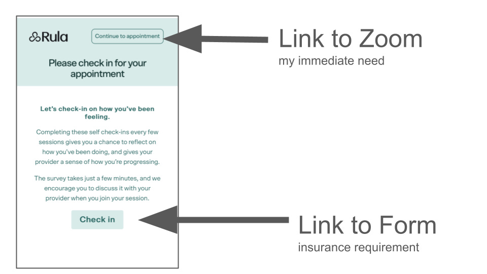
Why Rula Is Doing This: For a number of reasons, but mostly to get insurance to continue to cover my therapy, I must confirm that I am not going to kill myself and that I like my therapist. In short, I have to fill out a form every few weeks or my therapist can’t get paid. The form takes 2-5 minutes to fill out, making me (extra) late for my appointment. The first time I saw it, I thought they were refusing to let me meet with my therapist. It was stressful, to say the least. I wasn’t reading all the fine print. Who does when they are in a rush? And that is what they were betting on.
Known UX Patterns General web design has trained us to scan to the bottom and hit the submit button to reach the desired action. When doing that here, I get a form, not Zoom!! When you are late, this is a very, very frustrating experience. Eventually, (after 2 or 3 stress-inducing times), I realized there was a “continue to appointment” button at the top that looked like a header, not an action button.
As a product person, after I stopped being mad about being late for my appointment, I made an observation about the UI/UX decisions. They are relying on my instincts to drive me to the button at the bottom of the page, and the “continue to appointment” technically takes me where I want to go, not where they want me to go.
Lack of User Empathy I now know the game and just hit “continue to appointment,” but the first few times, I cursed the product team because I was late and they were preventing me from getting what I needed. There are a number of problems with the UX for Rula (that I will touch on in the future) that make me think they have not done any user testing. If the team had real empathy for the users, they would not make getting to their mental health complicated. They are creating a horrible experience for new users, who don’t know how the game is played. And existing users now have blindness to the form button when heading to an appointment.
Homework: Next time you see a delightful or disturbing user experience, take a screengrab. Take a moment to think about the user and why they are delighted or mad as hell. Bonus: Speculate about the product options (not) considered. This will help you build your product instinct.
Keep reading with a 7-day free trial
Subscribe to intrico.io | pm interview advice to keep reading this post and get 7 days of free access to the full post archives.